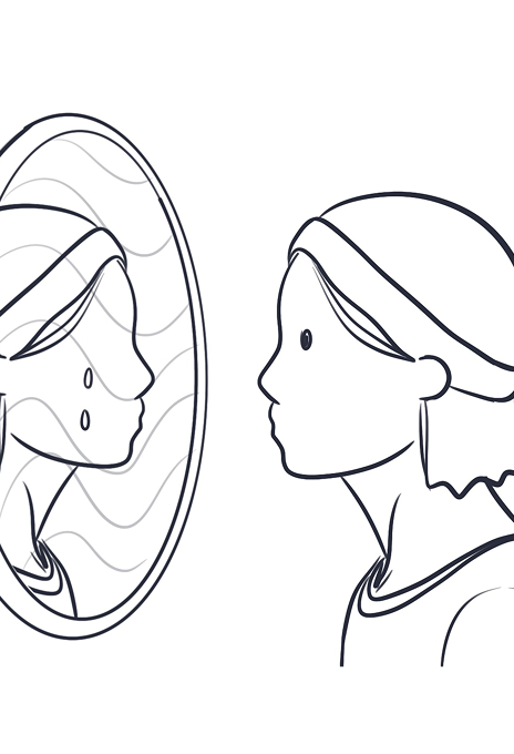
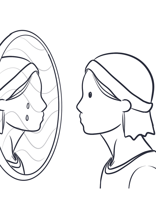
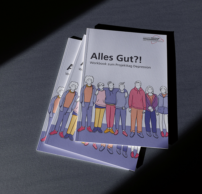
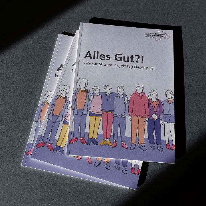
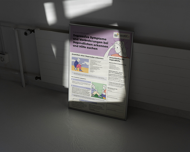
We began with a series of illustration sketches, developed in close collaboration with our client, the Stiftung Deutsche Depressionshilfe und Suizidprävention. The youth council played a key role, ensuring the visuals reflect the perspectives of young people.
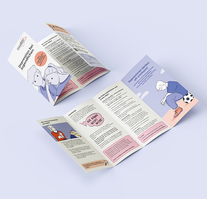
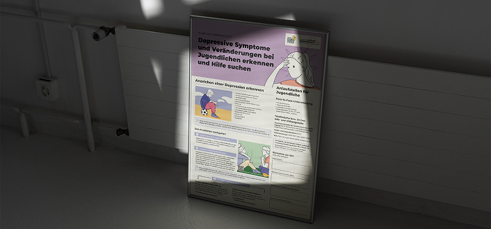
Step by step, we refined the concepts and finalized the illustrations in color—creating a clear, solution-oriented visual approach to topics like depression and mental health. In addition, we designed further materials to support the foundation’s educational work.
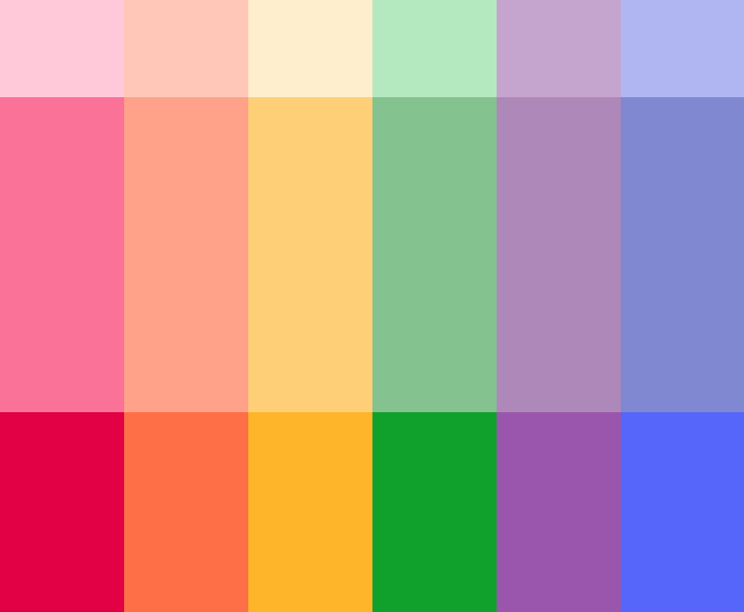
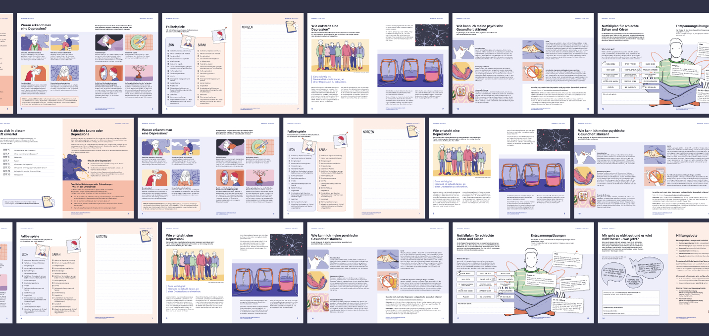
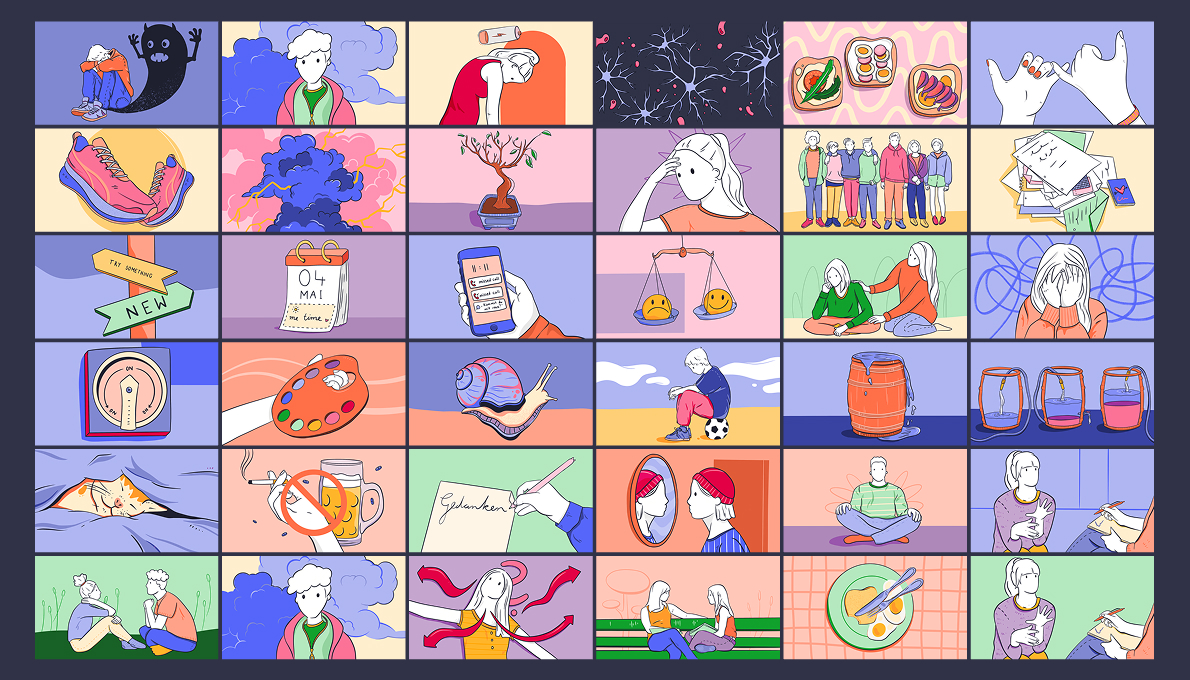
Colors
The mid-tone color values were predefined as part of the design framework. To bring depth and flexibility into the illustrations, we created additional gradations based on these mid-tones. This allowed us to build a coherent visual system, ensuring consistency while still providing enough variation for different themes and materials.
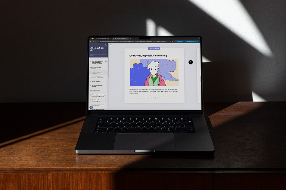
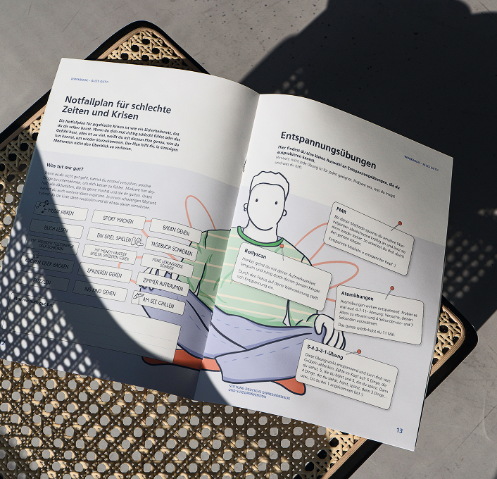
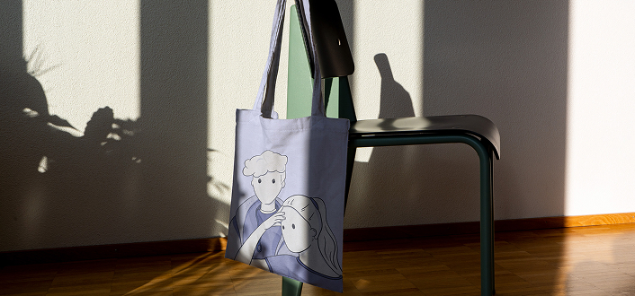
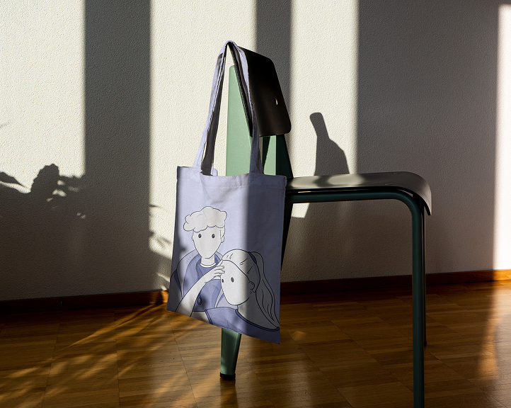
For each topic, we worked with the youth council to select images that make the content more accessible and relatable.
Based on all these elements, we created a flexible design system that can be applied to a wide range of materials—such as information flyers, postcards, and other formats—helping to reach both students and teachers effectively.