Branding
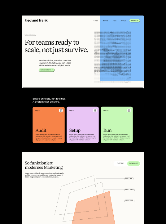
tied and frank
We craft the strategic core of your brand—defining its positioning, values, and purpose. With clear narratives and a focused identity, we build brands that are relevant, credible, and built to last.

Branding

tied and frank
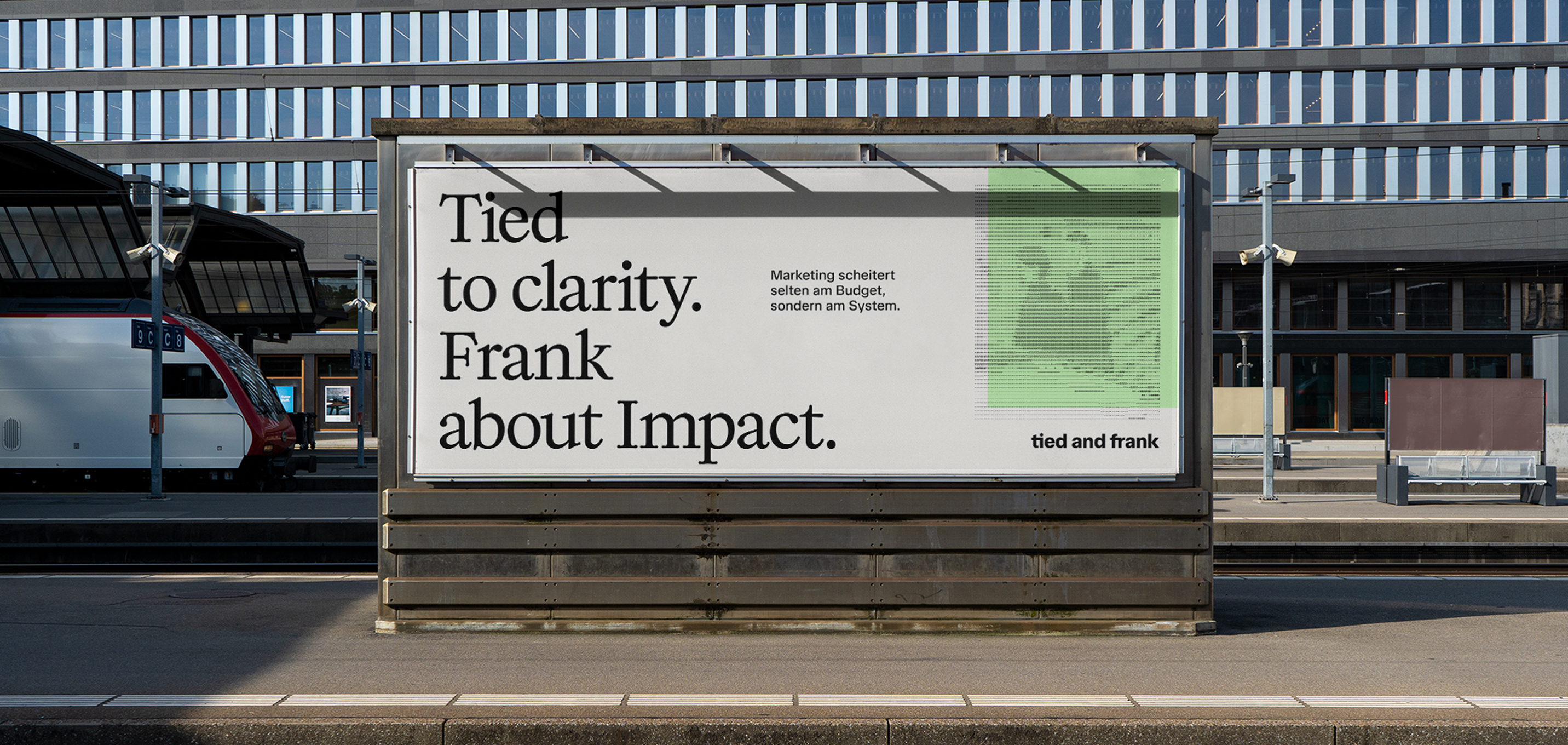
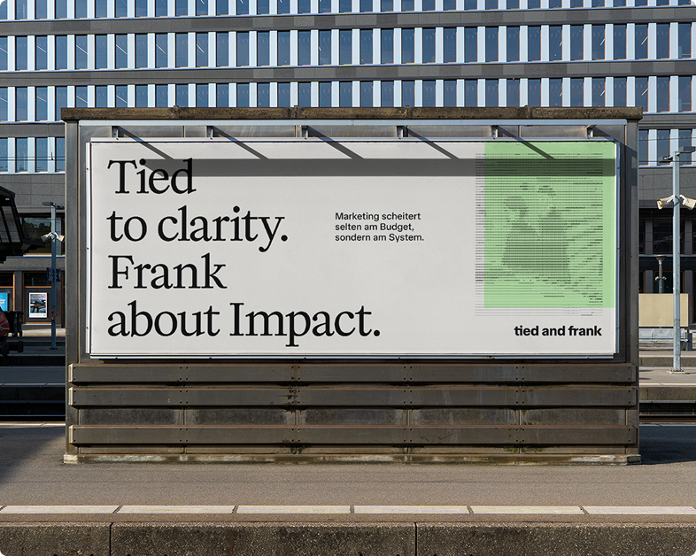
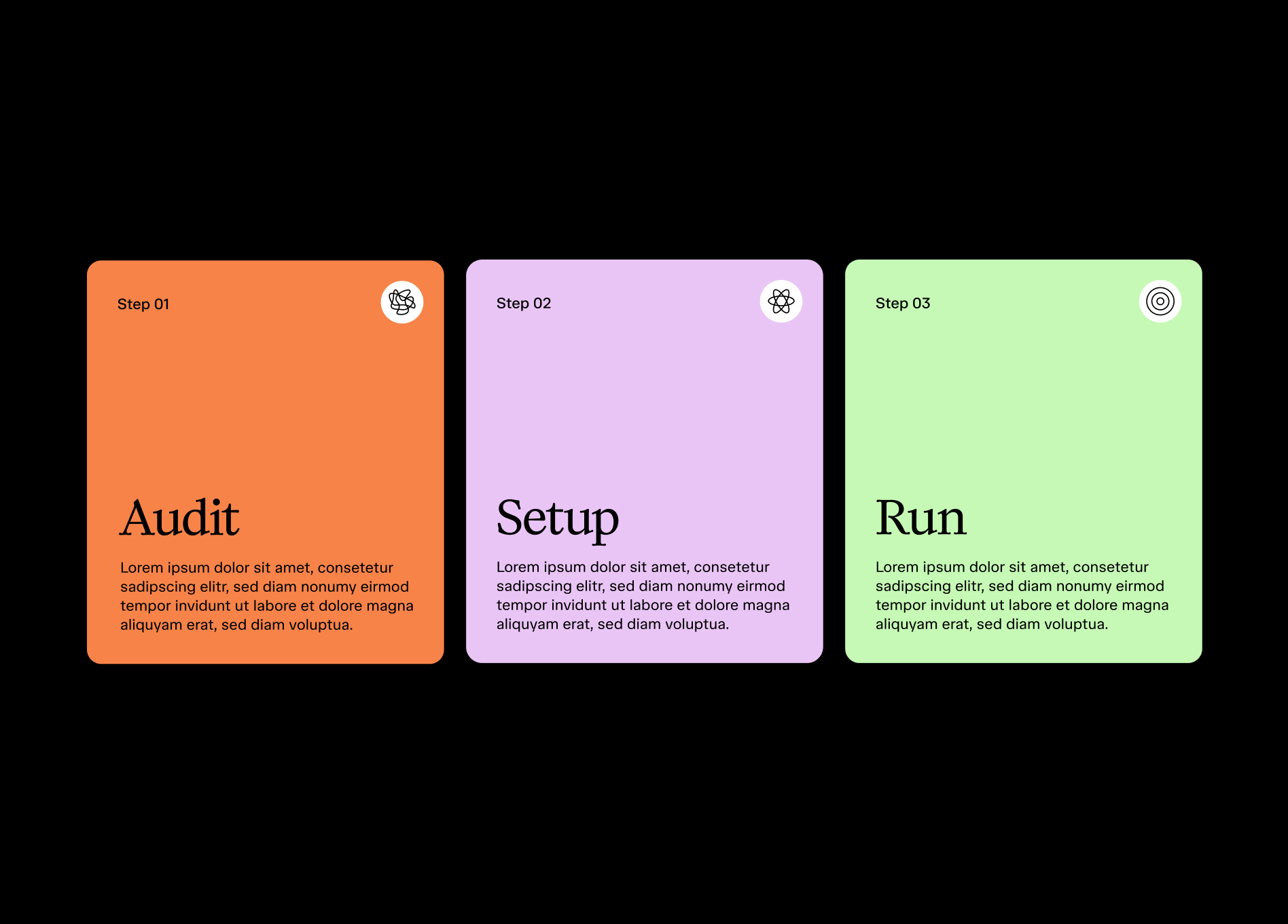
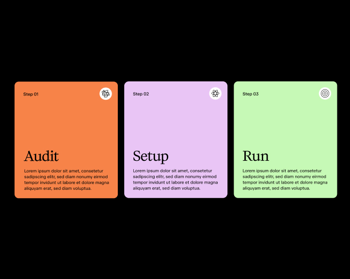
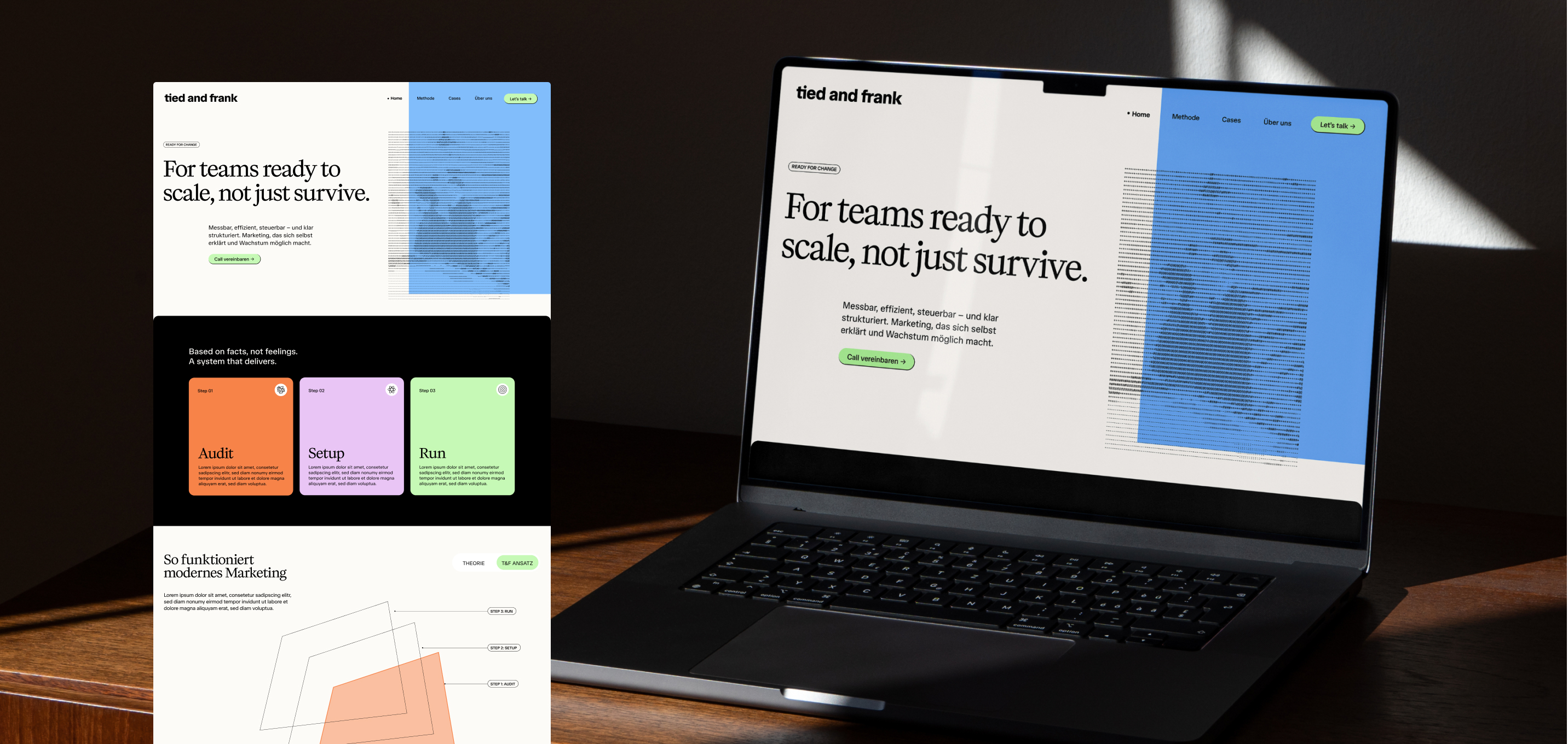
Tied and Frank is a consulting and transformation agency that helps companies make their marketing structures more efficient, measurable, and growth-oriented through technology- and data-driven systems.