Branding
Webdesign
Web development
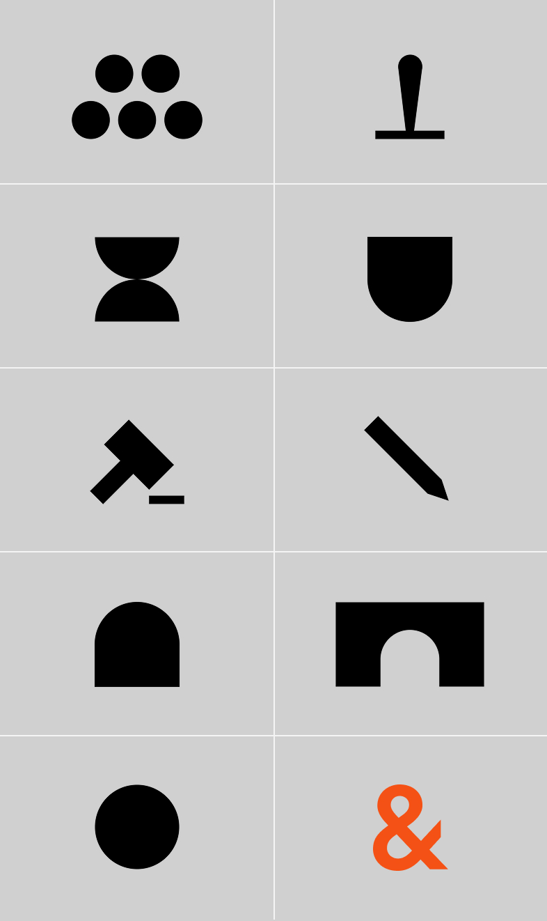
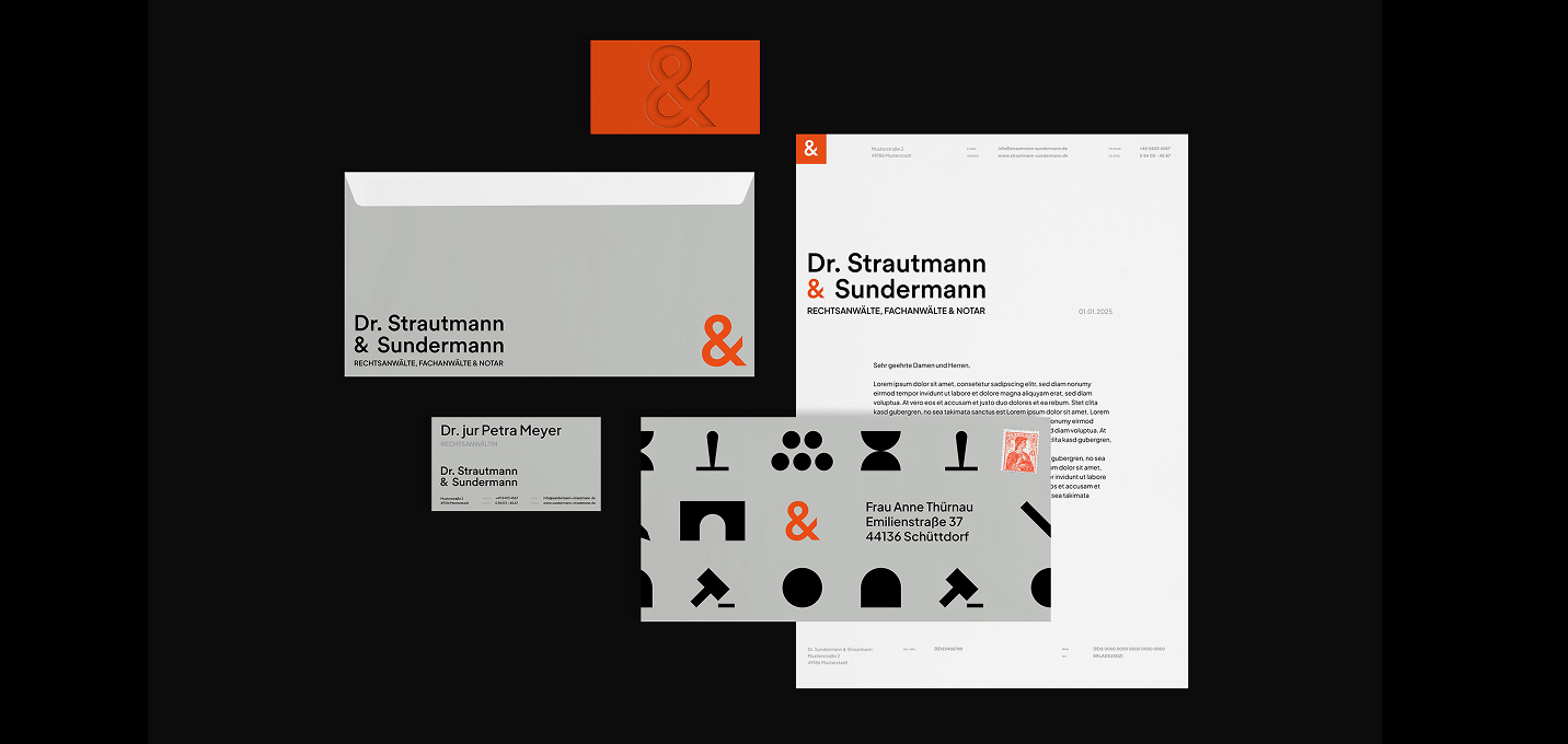
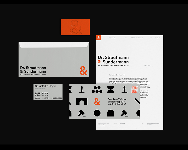
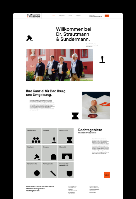
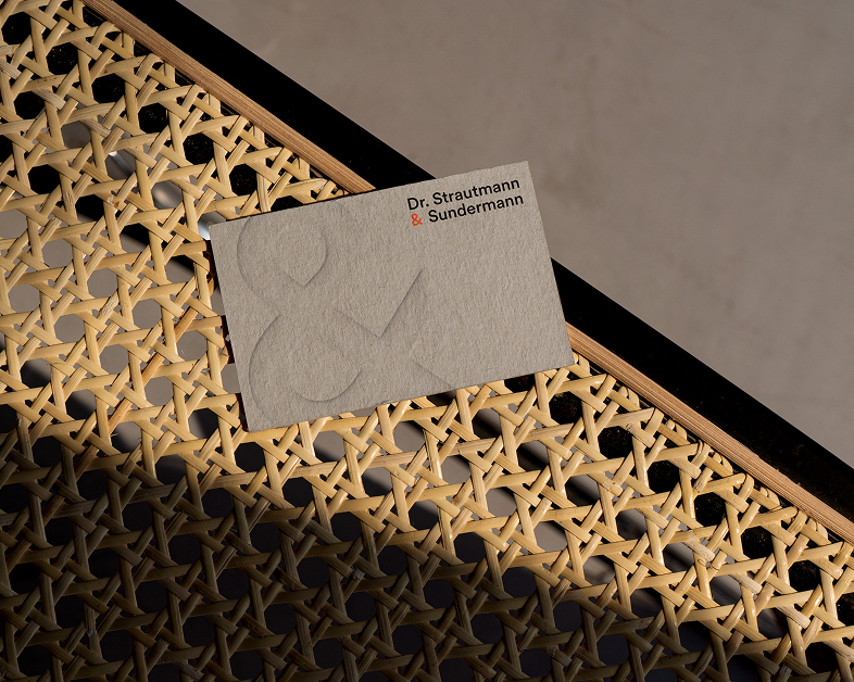
Dr. Strautmann & Sundermann
We craft the strategic core of your brand—defining its positioning, values, and purpose. With clear narratives and a focused identity, we build brands that are relevant, credible, and built to last.

Branding
Webdesign
Web development

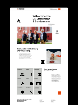
Dr. Strautmann & Sundermann
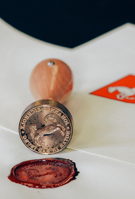
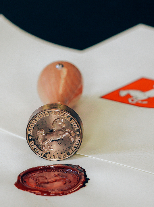
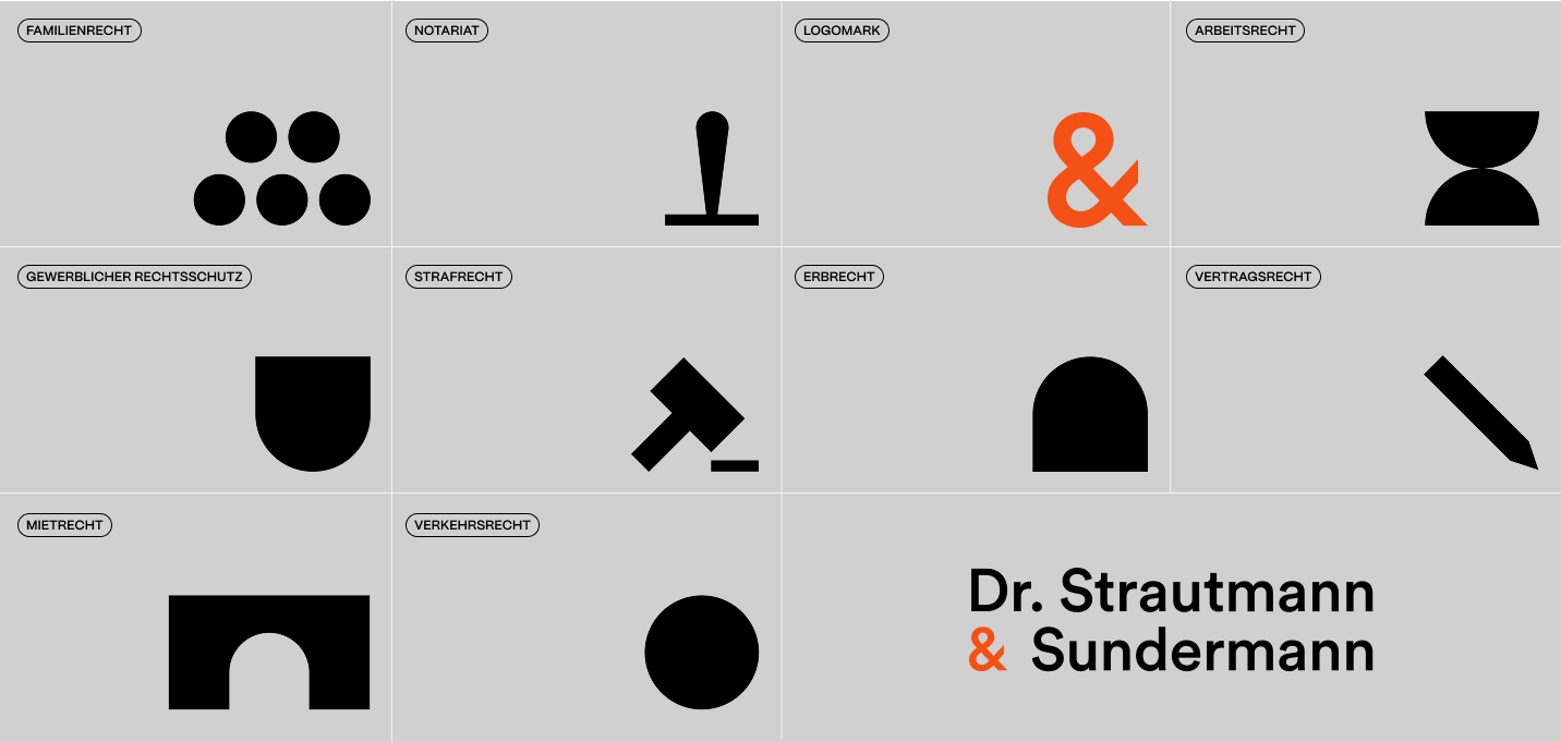
We developed the brand identity and website for the merger of two long-established law firms, uniting tradition with a modern direction. The result is an authentic and approachable brand that reflects both heritage and progress.