Branding
Webdesign
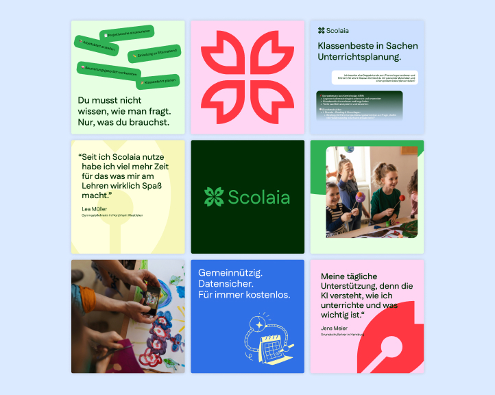
Scolaia
We craft the strategic core of your brand—defining its positioning, values, and purpose. With clear narratives and a focused identity, we build brands that are relevant, credible, and built to last.

Branding
Webdesign

Scolaia
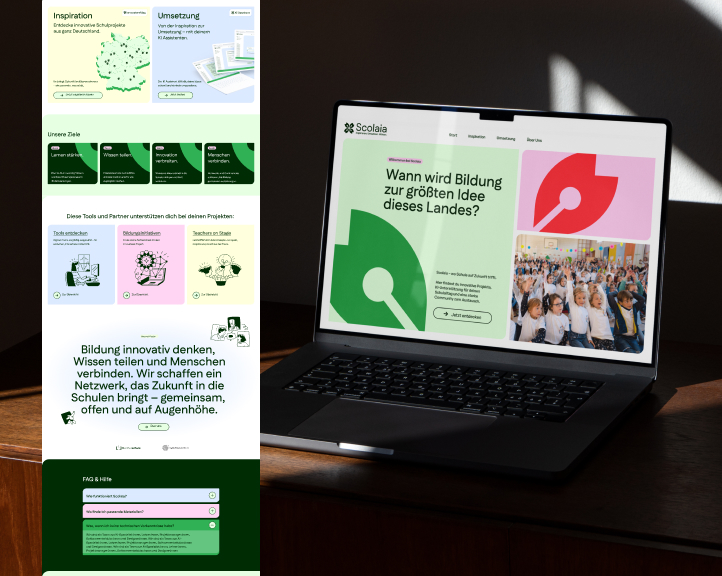
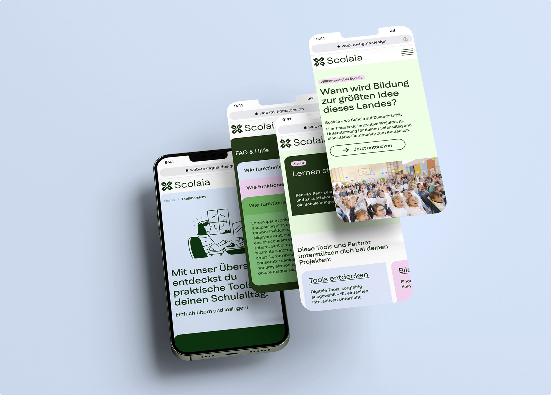
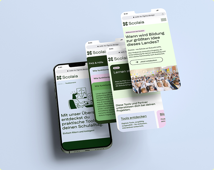
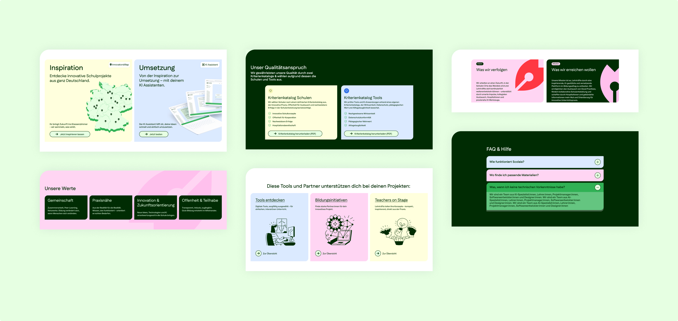
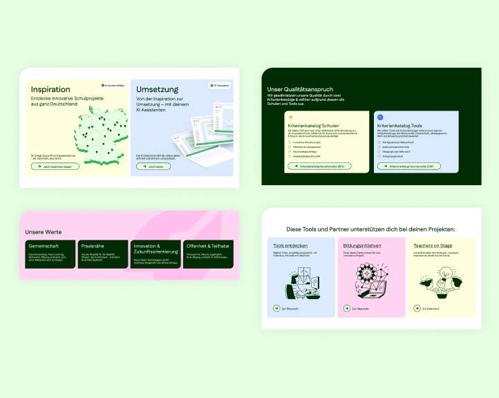
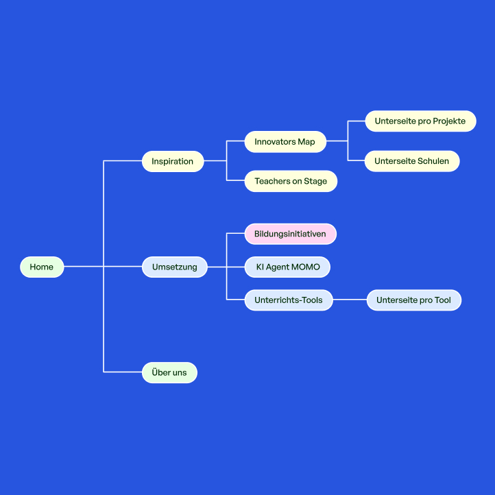
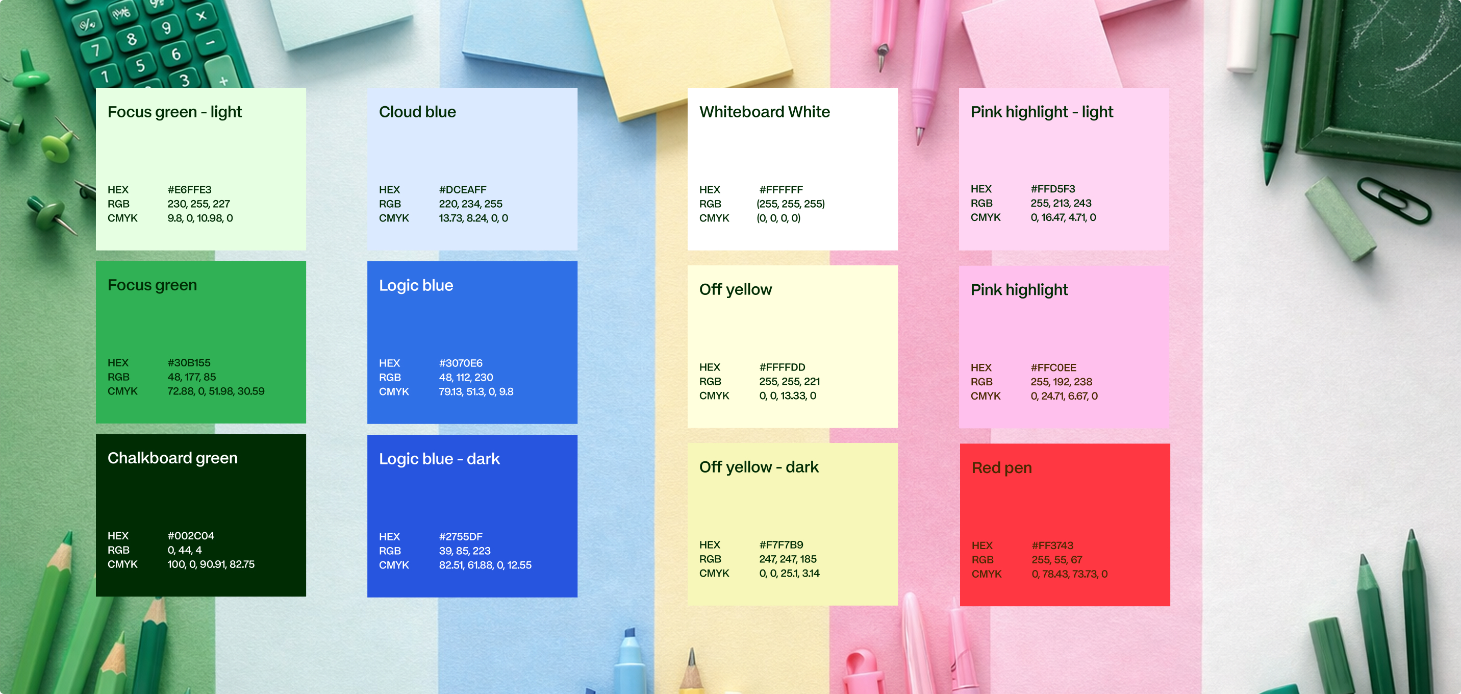
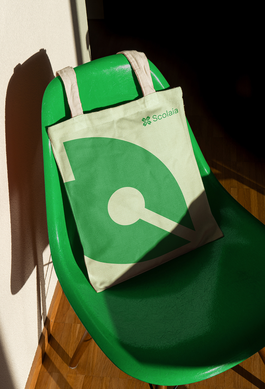
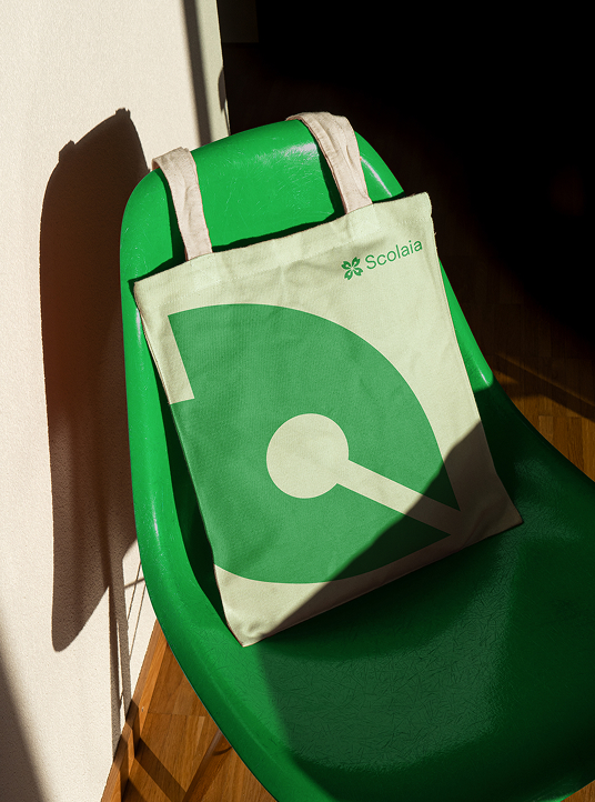
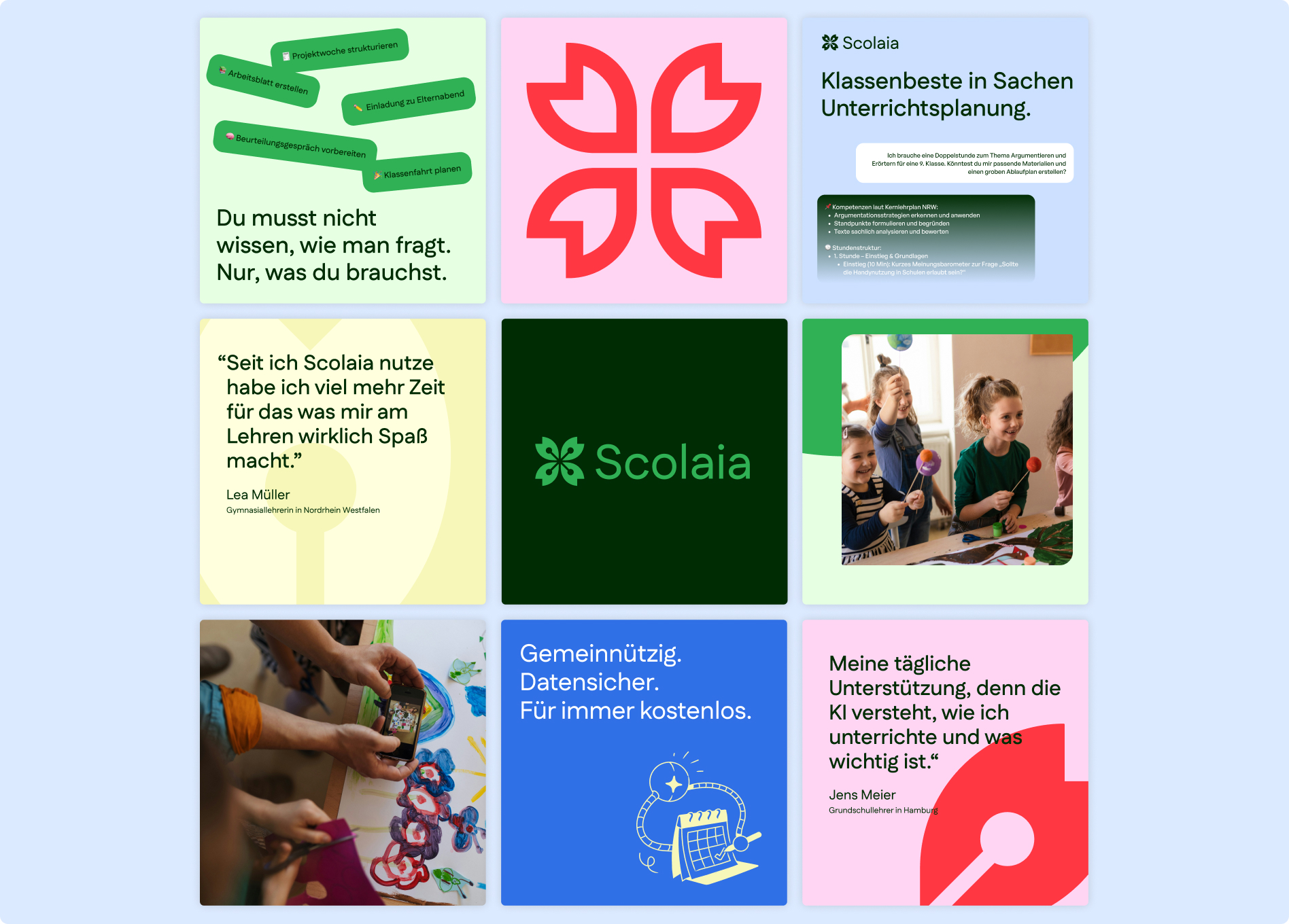
Scolaia is a digital platform that helps teachers navigate and apply new approaches in everyday school life. Structured into “Inspire” and “Implement”, it combines an interactive map of innovative school projects with practical tools for lesson planning.
We developed the brand identity and translated the vision into a clear, accessible and scalable digital experience — designing the overall platform and the InnovatorsMap as a cohesive ecosystem.
We developed the brand identity and translated the vision into a clear, accessible and scalable digital experience — designing the overall platform and the InnovatorsMap as a cohesive ecosystem.