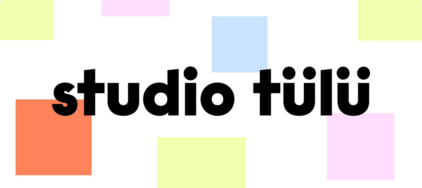
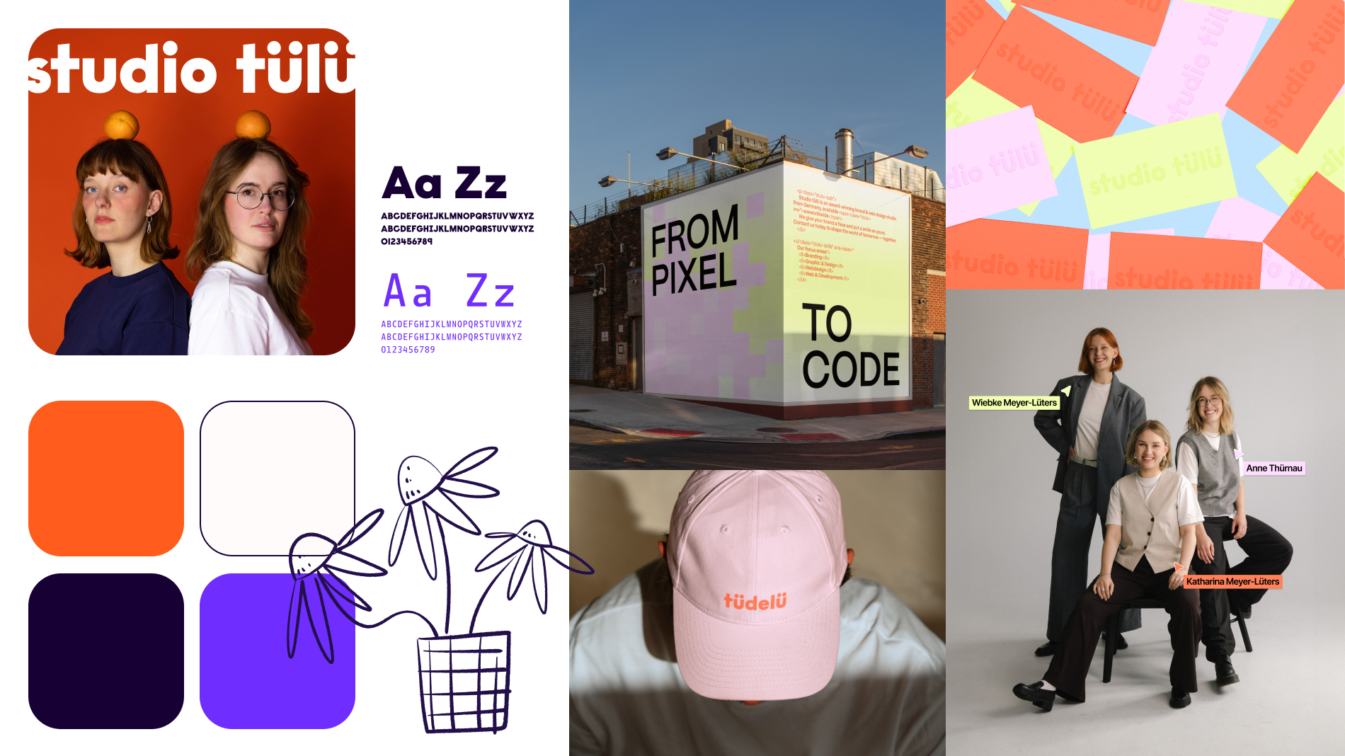
When we launched studio tülü in 2024, we put our first branding together in just a few days. It was spontaneous, bold, and exactly the right move to take our first steps.
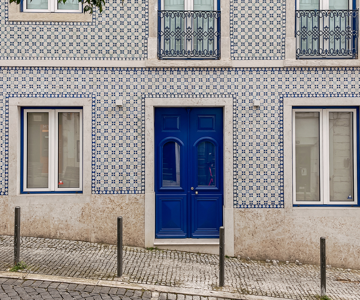
The origin goes back to Lisbon: during our trip in March 2024 – in the city where we once did our Erasmus semester and which remains part of our roots – Anne and Wiebke designed the very first branding for studio tülü in a small Airbnb. We defined values, set goals, and drafted our first plans. Out of these thoughts came the very first version of our brand and website – an appearance that aimed to look bigger and more trustworthy than we actually were at that moment.
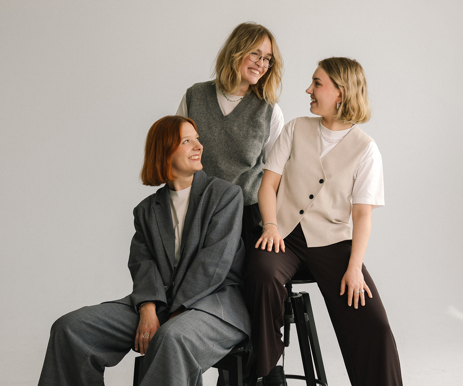
A year later it was clear: we had outgrown our own identity. With Katharina joining the team and many projects behind us, the old branding suddenly felt too small. We realized we needed to ask ourselves the same questions we usually ask our clients: Does our brand reflect what we do? Does it tell the story of who we are today? And does it give us enough space for what is yet to come?
Our answer was clear: we needed a rebrand.
2024 in Lisbon: Anne with the first logo draft for studio tülü.
Branding is not a fixed package that you create once and then never touch again. It grows with you, adapts to you, and sometimes needs to be rethought – that was exactly the point we had reached.
Our first design was intentionally playful and experimental – an expression of curiosity and the joy of trying things out. But over time we wanted to communicate something else: clarity, quality, and trust. These are qualities we bring into our work and that our clients also look for in us. Above all, our branding had to be able to give space to the many projects we have developed in the meantime. But how much self-expression should a design studio brand carry, and how much does it need to remain a “canvas” for client work?
Over the past two years we have questioned processes, explored new paths, and sharpened our way of working together. As a studio, as a team, and as individuals, we have grown – faster than we ever expected – and out of our first brand identity. With our new branding we want to show this. To show that we have grown in our thinking, in our structures, and in our appearance.
With this rebrand we are carrying that change outward. From a playful design language we have moved to a look that is clear and mature. Instead of bold contrasts, we now use color accents that reference our focus areas, and gradients that create openness and calm while still keeping tension.
Our new website embodies exactly that thought: clearly structured, reduced to the essentials, yet alive in the details. For us it is not just a digital business card, but a canvas for our projects – a space where design, content, and ideas can unfold.
Our rebrand is also a message: we have sharpened our identity and today we know exactly what we stand for. As a design studio based in Hamburg and Dortmund, we create distinctive brand experiences for companies, start-ups, and cultural institutions. Our specialty is developing and evolving brand strategies and corporate identities – and bringing them to life on the web.
Not only has our brand changed, but so have we. And because a new identity isn’t complete without current images, we stepped in front of the camera ourselves. Now it’s not only the design that matches, but also the faces.
A big shoutout to Marcel Frommer for the beautiful photos.
Good design always starts with ourselves. Only if we take our own identity seriously can we create strong brands for others.
For us, this rebrand was not a break but a next step. We renewed our foundation so it can hold the growth of the coming years. Our identity has become clearer, our direction sharper – and that is exactly what we also want to achieve for our clients.
Because we believe: good design can change the world.